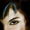
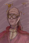
This set features the start of an intense discussion between Kassandra and her grandmother--Kallixene. Even with Ephoros at her back, Kassandra's on thin ice, not certain about which direction to go with her new-found family.
Here's the latest Saltwater Witch Newsletter:
us5.campaign-archive1.com/?u=1…
Or go direct!
www.saltwaterwitch.com
.
Painting on your iPhone with the Brushes app
And all painted on an iPhone.
Here's the first in a series of tutorials to share some of the things I do when I paint with the Brushes app on the iPhone (everything here also works on iPod Touch). These aren’t in order, although I might consider some more important than others, or maybe a better way to put it: some of these are work-for-me-but-may-not-work-for-you kinds of techniques, while others are just things to try, and still others are general use and I’d advise using them no matter who you are.I am by no means an expert with Brushes, but I’ve been using this wonderful painting app for months, and I’ve settled into a bunch of techniques I use over and over. (For digital work I mainly use Painter, Art Rage, Photoshop on a Wacom). Here are a few things I’ve painted entirely with Brushes, starting with a blank canvas, and using all of the tools in the Brushes set. (Click to see the full view).


More—with videos: www.flickr.com/photos/the0phra…
Okay, let’s get started.
I've broken this up into a set of "techniques", which run from advice, to the painting processes I use, tools I like and use, and other suggestions. Again, some of these work for me, and may work for you. Try them out, let me know what you think, let me know what I'm missing.
Technique: Start with a background and tell a story
Or just start fiddling and see if a story shows up on its own. Start with a blank Brushes canvas by hitting the + sign. Open up the brush size dialogue and slide it right, to the largest size. Pick a color, any color, and keep the transparency slider somewhere less than the middle. (You can also slide the brush selector to the bristly one--my favorite).
<img alt="IMG_0679" class="asset asset-image at-xid-6a00d8341c7bd653ef012875b86e50970c " src="the0phrastus.typepad.com/.a/6a…" style="width: 200px;" />
Start painting. I like to make some broad strokes across the background, usually at an angle, sometimes angling both sides toward the middle giving it looking down from a great height sort of lines, sometimes zig-zags or ocean waves. Pick a direction and paint. For now, try to cover the background without lifting your finger—this creates an even tone with the selected color and transparency. The fun stuff starts happening when you lift your finger and paint over the previous paint you just put down. This is where the brush transparency plays an exciting role, laying down a less transparent stroke with the same paint color. Try leaving some white space, try different transparency settings and colors—unfortunately Brushes doesn’t currently support blending, smearing, color mixing, but it still allows you to do some wonderful things with transparency.More than likely you’ll see a pattern emerge, a treeline, mountain, the edge of a forest, a dark street. I consider myself an author before an Illustrator. I love telling stories. I love creating characters, places, conflict, and danger. Look for the pattern or story in the background and bring it to life.
I start just about every painting in Brushes with one of two things in mind: A general idea of a character, place, scene. Or nothing whatsoever. When I haven't the foggiest clue what I want to paint, I pick a color, set the transparency to about a quarter way up from the bottom, slide to the widest brush, play with the strokes, and look for the patterns that emerge. At the first sign of an interesting edge or angling shadows I usually add a layer, move to black and the smallest brush size, then trace some of the outlines, bring the shapes to the foreground, make the edges of the unknown clearer. Before you know it, you’ll have a heaving ocean, the mouth of a cave, a sky full of stars, a forest of blue trees, or a microscopic view of fresh cut grass.
Here’s a set of backgrounds I recently worked up in a coffee shop over lunch, just playing with brush sizes, colors, and transparency:
<img alt="IMG_0675" class="asset asset-image at-xid-6a00d8341c7bd653ef012875b84435970c " src="the0phrastus.typepad.com/.a/6a…" style="width: 140px;" /> <img alt="IMG_0677" class="asset asset-image at-xid-6a00d8341c7bd653ef0120a6b67d6b970b " src="the0phrastus.typepad.com/.a/6a…" style="width: 140px;" /> <img alt="IMG_0676" class="asset asset-image at-xid-6a00d8341c7bd653ef012875b8448a970c " src="the0phrastus.typepad.com/.a/6a…" style="width: 200px;" />
Technique: Use a mix of broad brush strokes to create shapes and define them
Sometimes I start small, sometimes big. If I’m thinking I need an airship in the foreground, I’ll create a new layer and use a big brush to give me a general shape for this airship. Then I’ll go to the smallest brush and give it definition, create the edges, refine the big pointy looking blob into something that looks airship-ish.
I think it depends on what you’re drawing. It may make sense to create a new layer and use the smallest brush to outline a figure, the horizon, ocean waves, or a 24-hour diner in the treetops. Then on another layer, use a broad brush to fill in with solid color—again, use transparency to your advantage. I rarely use a full solid color unless I’m drawing lines with a tiny brush. You can also do some fantastic shading and reflection with the transparency down very low and then going over a shaded or highlighted area repeatedly.
I'm painting something inetresting for this set of techniques, and here's what I started with, a background with a few colors and then some defining with the smallest brush:
<img alt="IMG_0662" class="asset asset-image at-xid-6a00d8341c7bd653ef012875b84696970c " src="the0phrastus.typepad.com/.a/6a…" style="width: 240px;" /> <img alt="IMG_0663" class="asset asset-image at-xid-6a00d8341c7bd653ef0120a6b67fa5970b " src="the0phrastus.typepad.com/.a/6a…" style="width: 240px;" />
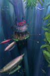
I pictured trees, giant blue trees with an airship-catering all-night diner a hundred meters off the ground.
<img alt="IMG_0650" class="asset asset-image at-xid-6a00d8341c7bd653ef012875b851e5970c " src="the0phrastus.typepad.com/.a/6a…" style="width: 100px;" /> <img alt="IMG_0652" class="asset asset-image at-xid-6a00d8341c7bd653ef012875b85220970c " src="the0phrastus.typepad.com/.a/6a…" style="width: 100px;" /> <img alt="IMG_0653" class="asset asset-image at-xid-6a00d8341c7bd653ef012875b8525a970c " src="the0phrastus.typepad.com/.a/6a…" style="width: 100px;" /> <img alt="IMG_0654" class="asset asset-image at-xid-6a00d8341c7bd653ef012875b852b9970c " src="the0phrastus.typepad.com/.a/6a…" style="width: 100px;" /> <img alt="IMG_0657" class="asset asset-image at-xid-6a00d8341c7bd653ef0120a6b689b1970b " src="the0phrastus.typepad.com/.a/6a…" style="width: 100px;" />
I drew the basic structure of Nazca's All-Nite Diner, and then started adding details, lights, some bracing--with shadow and highlight using a nearly transparent brush:
<img alt="IMG_0661" class="asset asset-image at-xid-6a00d8341c7bd653ef012875b8571f970c " src="the0phrastus.typepad.com/.a/6a…" style="width: 200px;" /> <img alt="IMG_0659" class="asset asset-image at-xid-6a00d8341c7bd653ef0120a6b68d51970b " src="the0phrastus.typepad.com/.a/6a…" style="width: 160px;" /> <img alt="IMG_0660" class="asset asset-image at-xid-6a00d8341c7bd653ef012875b857e3970c " src="the0phrastus.typepad.com/.a/6a…" style="width: 160px;" />
Technique: Finger-painting works better than a stylus
You may not think so, and I didn't either when I started out with Brushes. I bought a stylus, used it for a few days, and have never picked it up again. If a stylus works for you, use it. I think the perception is that a stylus (a pen like device for drawing on the screen) will give you accuracy, better fine line drawing, and while I think this is generally correct, there's a serious downside: it affects the way I use Brushes. While painting I'm constantly hitting the Brushes toolbar buttons--undo, layers, brush sizing, colors. In a typical work I'll hit undo five hundred times or more, I'll change colors and brushes a hundred times, roll through a hundred layers. The stylus quickly became a pain to flip out of the way every time I wanted to select buttons, colors, and anything else. And with a little practice I've found I have everything I wanted: accuracy, pressure/touch sensitivity, and easy access to the toolbar with my fingers. Fingers work better. Try them out.Technique: Undo
Use it like it's keeps your heart beating. Paint with the boldness of grizzly bears on Red Bull, because you can always undo anything you paint. This feeds into the next technique on using layers. I can't tell you how many times I've created a layer just to see what something looks like, then if I don't like it, I'll trash the whole layer. Another tip that fits with this is to create duplicates of your work as you go. When I get to a settled point in the painting--and there can be ten of these along the way in a single work, I'll click the "Done" button, and in the lower left, select "Duplicate Painting." I've only gone back and started with an earlier version four or five times, but it's a peace of mind thing--knowing that if I somehow crap up a painting, I can always go back and start over with a good copy with layers intact.
<img alt="IMG_0673" class="asset asset-image at-xid-6a00d8341c7bd653ef012875b84910970c " src="the0phrastus.typepad.com/.a/6a…" style="width: 200px;" /> <img alt="IMG_0672" class="asset asset-image at-xid-6a00d8341c7bd653ef012875b8496b970c " src="the0phrastus.typepad.com/.a/6a…" style="width: 200px;" />
Technique: Sometimes you can’t undo
Get used to this. You’re pinching and expanding the canvas, painting, hitting buttons, more painting, doing all kinds of things. And sometimes you’ll paint a line you don’t want and you won’t notice it until you’ve flattened the layers and you’re a hundred paint strokes on. What you can’t undo, you can paint over. Maybe this isn’t a technique all on its own, but I wanted to call this out as something that is going to happen. I do it all the time. Painting along, everything looks lovely, and there’s a thin orange line through the center of the work. The only thing you can do is create a new layer, use the dropper tool to set the color next to the offending paint, and paint over it with little or no transparency.Here’s a real example from the work I’m doing for this set of techniques:
<img alt="IMG_0655" class="asset asset-image at-xid-6a00d8341c7bd653ef0120a6b68364970b " src="the0phrastus.typepad.com/.a/6a…" style="width: 200px;" /> <img alt="IMG_0656" class="asset asset-image at-xid-6a00d8341c7bd653ef012875b84b30970c " src="the0phrastus.typepad.com/.a/6a…" style="width: 200px;" />
Technique: Use hundreds of layers
Create a new layer for everything, a new highlight, shadow, new figure, every cloud in the sky. Give them all layers. Brushes currently supports five layers, so make new ones and flatten as you go. When I paint in Art Rage, Painter, or Photoshop, I use dozens of layers. I just keep adding new ones as I proceed through a painting. I know some artists--when they use Photoshop--like Stephan Martiniere (www.martiniere.com) go through a hundred layers or more on most works. Crazy cool.Here’s what the layer panel looks like:
<img alt="IMG_0649" class="asset asset-image at-xid-6a00d8341c7bd653ef0120a6b6843f970b " src="the0phrastus.typepad.com/.a/6a…" style="width: 250px;" />
Click the + to create a new layer above the currently selected layer (that’s the one with the blue outline). With layers, you can draw at different depths in your painting. The checkboard pattern is the layer’s transparency—this won’t show up in your work, but lets you know what’s solid and what’s not—what’s going to show through any particular layer from the layer underneath it.
Click the down-arrow to merge layers. Brushes currently supports five full layers, and if you need another you’ll have to flatten the image a bit. Over the course of a painting I will run up to five layers and flatten twenty or thirty times.Okay, that’s enough for today. Here’s where I am with Nazca’s All Nite Diner, a late night crew of the airship Herakleia pulling into a berth because the captain has a craving for that insanely good summer squash and barbecue chicken pizza Nazca is famous for. And the coffee. Damn good coffee.
One final note on image quality: Brushes allows you to download and create a high resolution rendering of any .brushes file, which is essentially a store of every recorded brush stroke for a work, with all its attributes, including color, transparency, layer, etc. For a quick copy of your work you can also have Brushes send a lower res version to your camera roll and from there, email it to yourself or sync the images with your computer.
This is a low-res copy--nice enough for posting, but it gets a bit jagged when blown up.
<img class="asset asset-image at-xid-6a00d8341c7bd653ef012875bcf5f5970c" style="width: 420px;" alt="NazcasDinerDISP" src="the0phrastus.typepad.com/.a/6a…" />
Go paint!

.
If you bundle the plotting, characterization, everything that goes into writing a novel, then the process looks like this:
You have an infinite (or nearly so) stretch of flat ground in every direction (imagine standing by yourself on the salt flats with no distinguishable features, nothing but blue sky and white sand to the horizon) and an infinite number of bowling balls, as well as a just-in-time manufacturing facility for any color or size bowling ball. You want solid gold with swirls of purple ice? Done.
Page one...You got your special bowling shoes on?
So, you're standing in the middle of nowhere, white sand in every direction, and there's one of those bowling ball delivery systems...just coming out of the ground with any number of bowling balls. You can talk to it, too, ask for a bowling ball to represent your main plot line, ten more for sub plot lines, scenes, pivotal points, any kind of action.
On this writing ground that goes on forever, directions correspond to plot lines, and the kinds of bowling balls--color, patterns, materials correspond to individual plot elements, individual characters, actions, scenes, even lines of tension.
In the course of writing your novel, you're going to be grabbing a bowling ball and rolling it in a specific direction. In the beginning of your novel that's all you'll be doing, grabbing the next ball that comes up, pick a direction, get your stance, take your steps and release. The ball is away. Go back for another.
Now, let's look at what your novel looks like halfway through.
Here's the way it works. You can send fifty bowling balls off in almost the same direction--close enough that when the time comes to start wrapping up plotlines, you don't need to travel too far. You're a mile out and you have plenty of room and time and stop one from rolling forever.
You can send fifty off in roughly the same direction, and then turn and send another ten in the opposite direction. You still won't have trouble wrapping up your story, because you'll have time to cover both directions.
Now, if you're planning something grand, a series with plots that extend well beyond the current book, there's no problem sending bowling balls of many colors off in twenty different directions. You'd have to be a genius--and very quick--to close all those down with probability and reader satisfaction in one book. But in all likelihood, you want them to just keep rolling. You'll pick them up in the next book, maybe even give them a kick to change direction, or a shove to increase speed.
Make sense to anyone? No, I didn't think so. Me neither.
About...


My first novel SEABORN came out in July from Juno Books
Find out more at SaltwaterWitch.com
I blog at theophrast.us
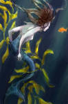
I am a novelist and short story writer--but I am a writer who also paints. I work in watercolors and digital formats, sometimes mixing them. Most of my recent artwork has a sea theme, which comes out of my fiction writing over the last three years. There are particular themes I enjoy studying and expressing, the ocean as a source of life and dark forests.